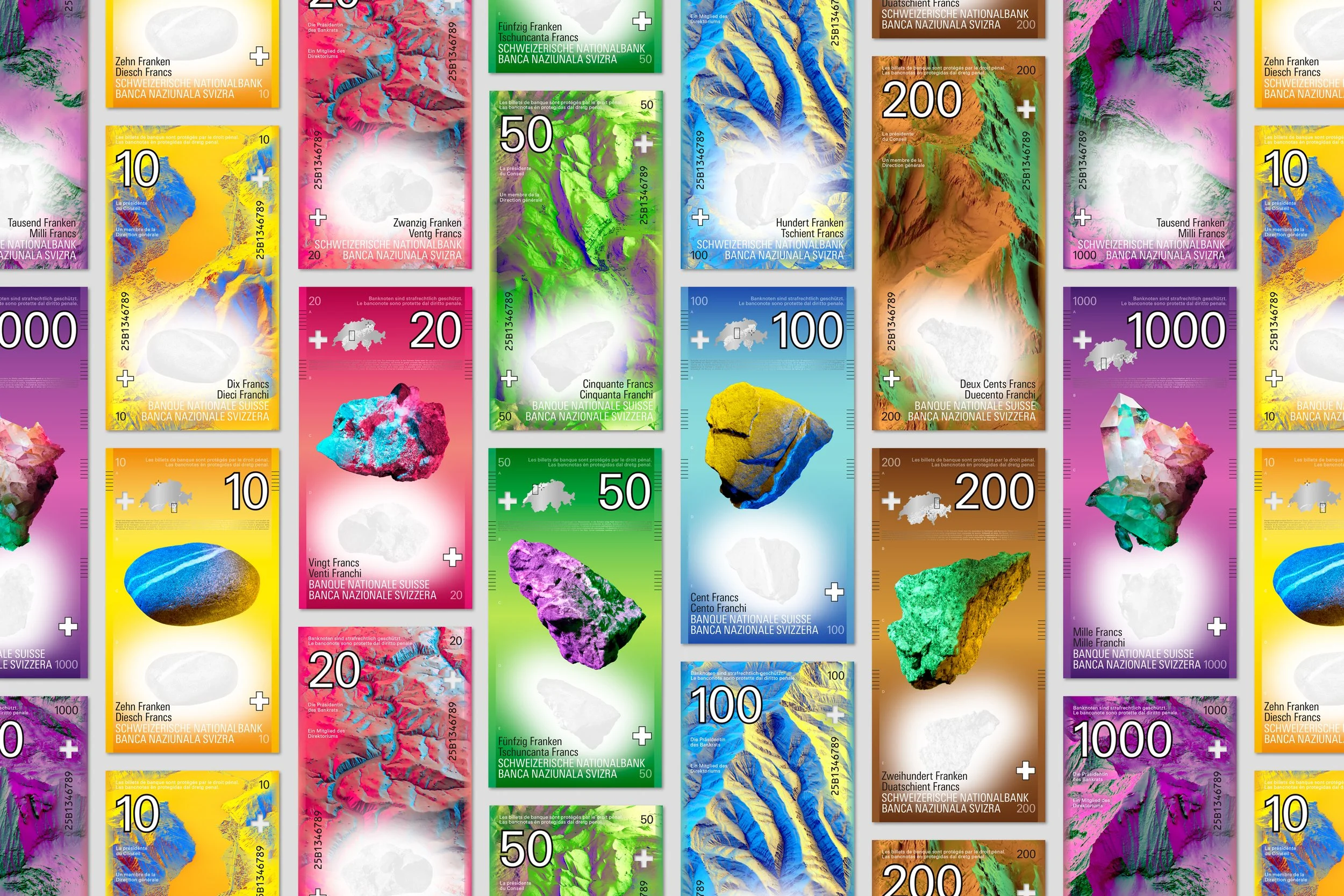
swiss banknote series
design proposal for the next series of banknotes as part of the swiss national bank’s invited competition.
the concept was ranked in first place by the advisory board. however, a different design was chosen for the final realisation.
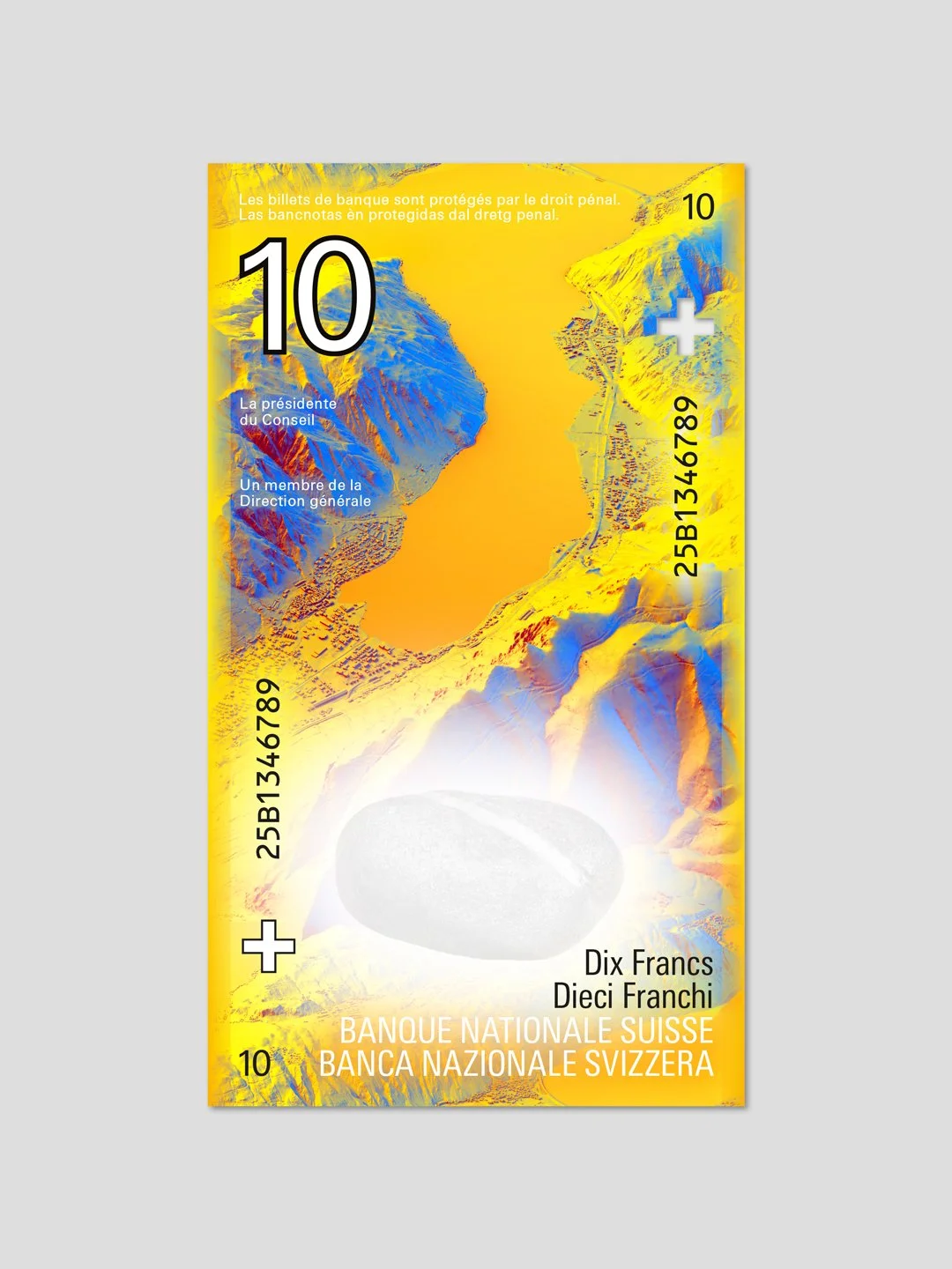
no country in europe is as heavily influenced by differences in altitude as switzerland. around 70 per cent of its territory consists of mountains – a distinctive feature of the landscape that has a significant cultural and economic impact.
as a hard currency, the swiss franc is internationally synonymous with stability and reliability. the concept combines these two aspects into one narrative: rock as a symbol of geographical origin and economic substance.
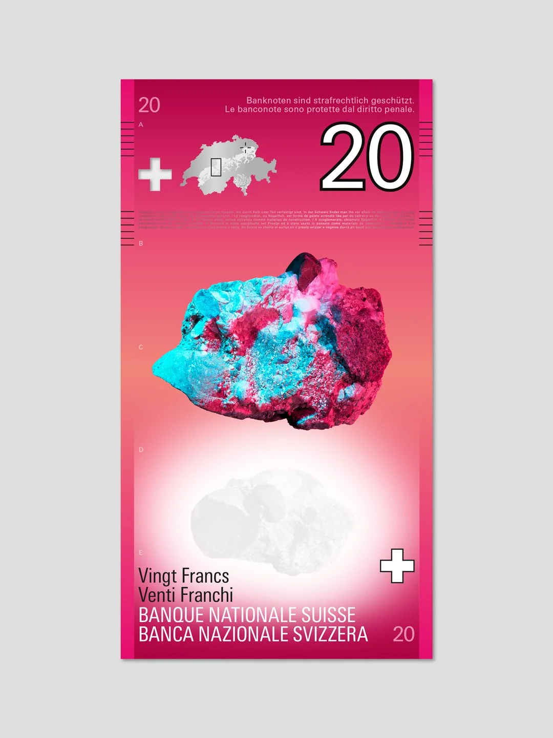
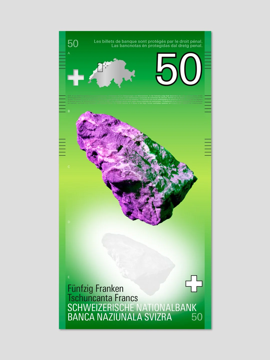
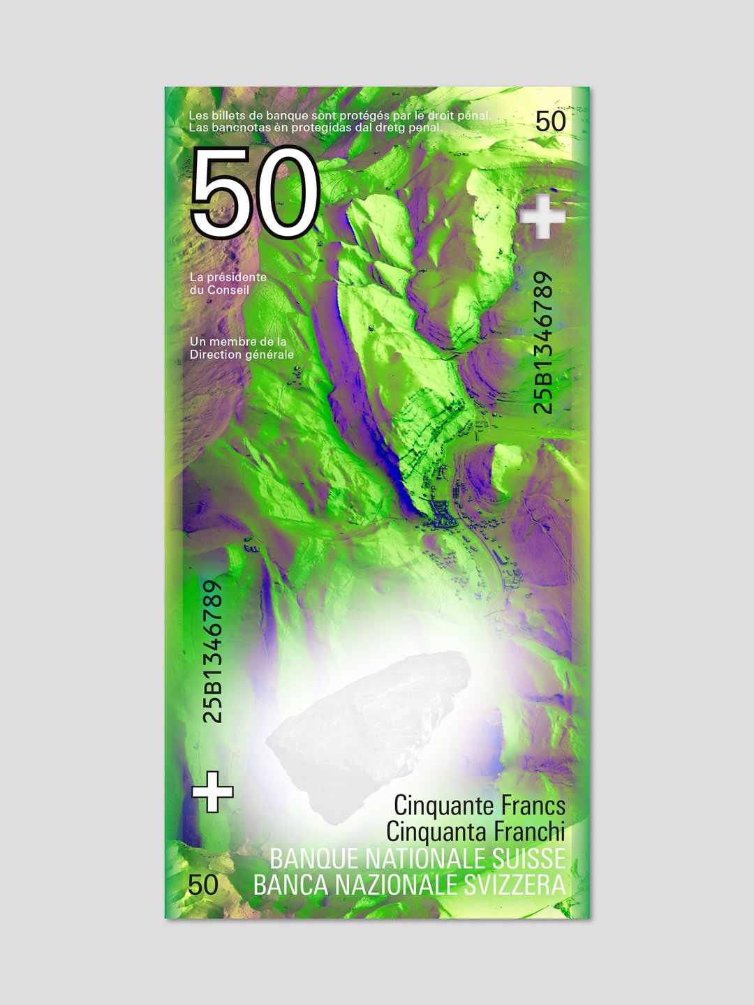
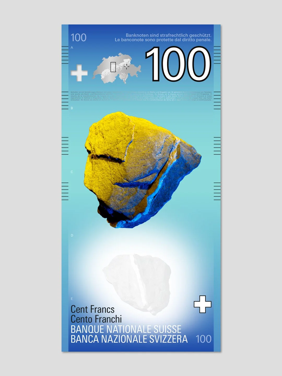
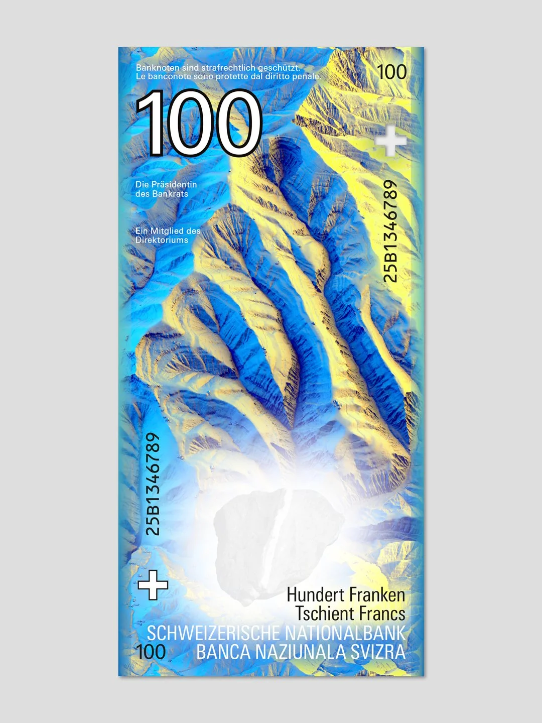
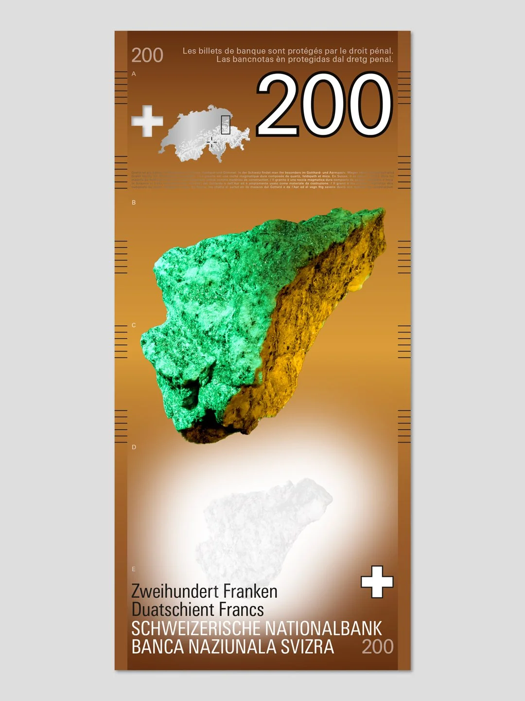
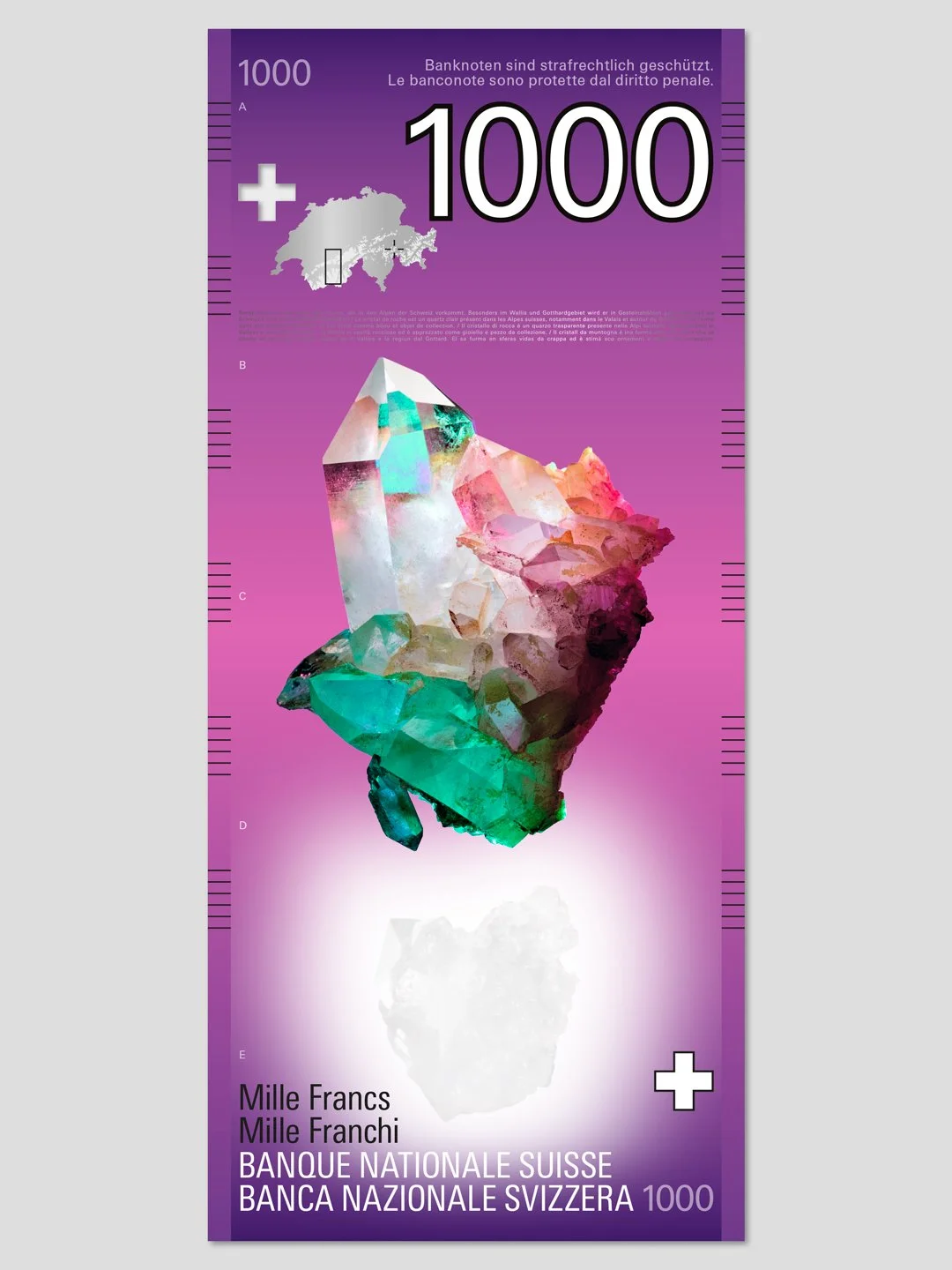
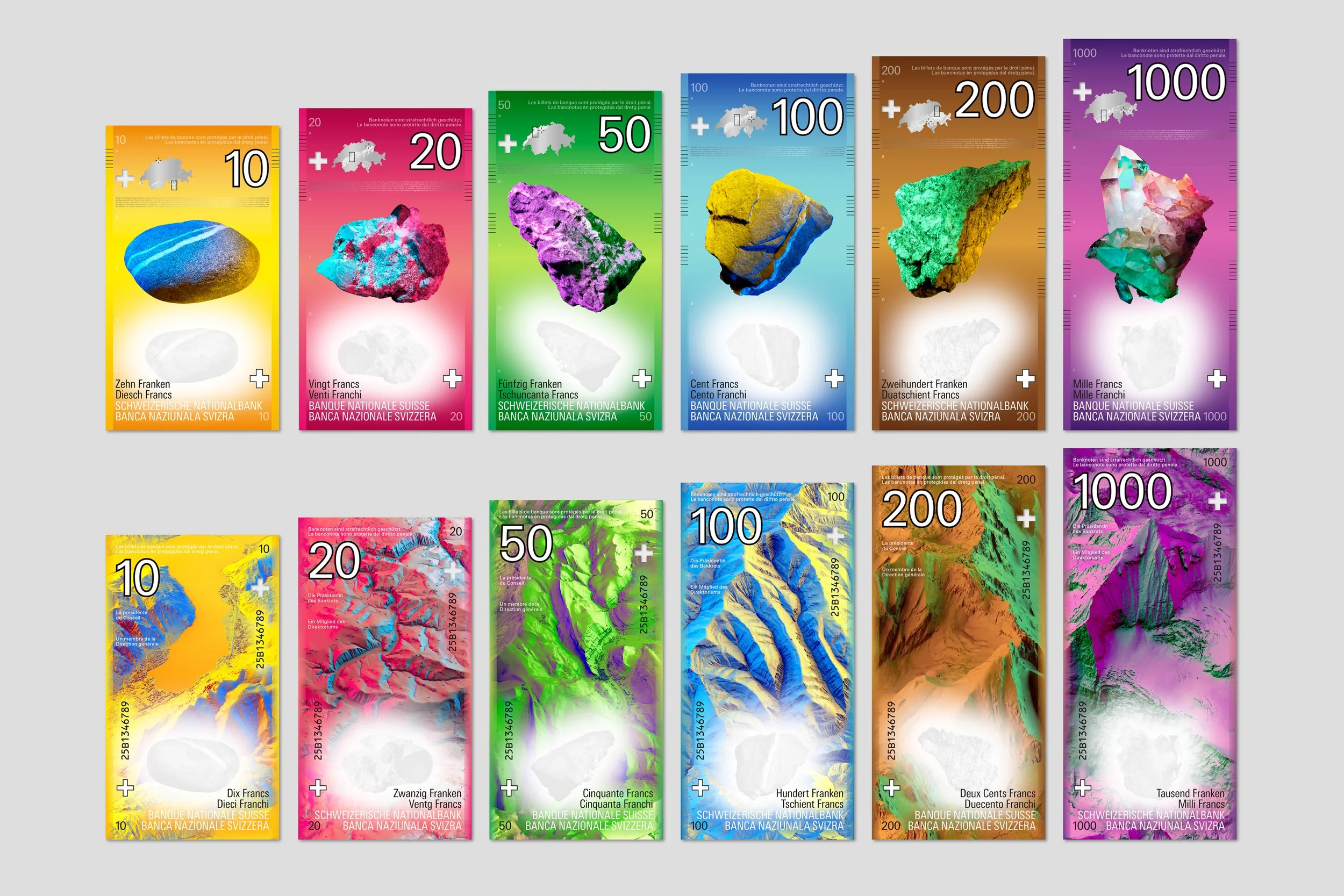
each banknote features a stone collected at a specific altitude, photographed at original scale with maximum precision. the stones form a mineral spectrum ranging from river pebble (lowlands) to rock crystal (high alps) – each one a distinct portrait of place and geological time.
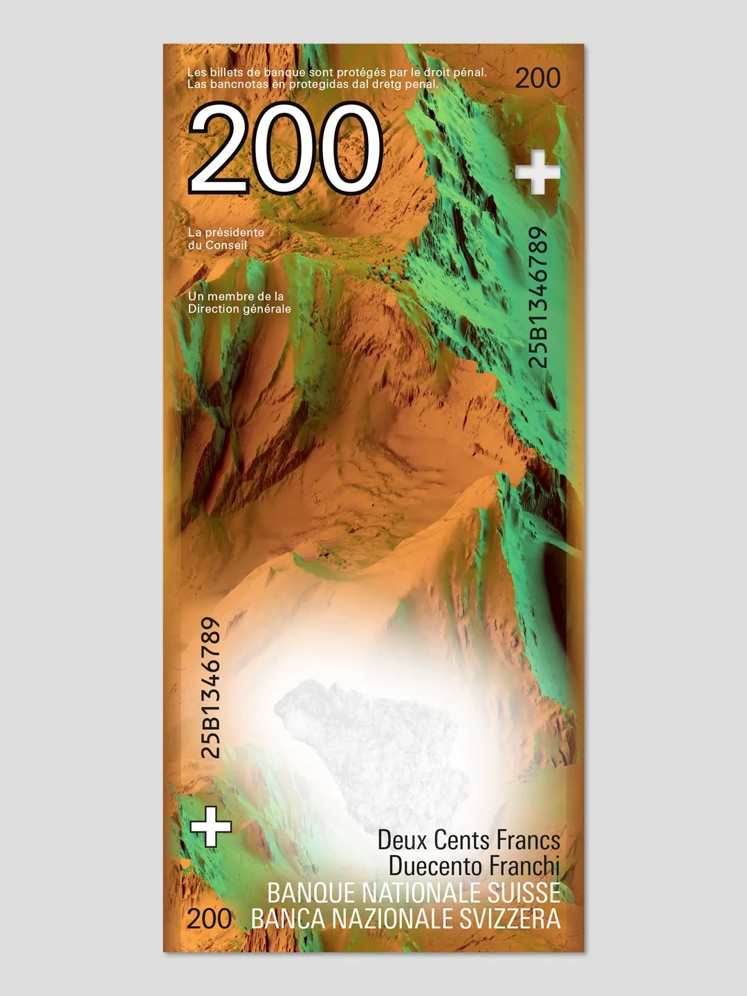
the reverse sides show abstracted landscapes based on swisstopo data – real places reduced to their topography, lighting and form. the strong gradation illustrates the typical settlement structures of the altitude levels.
this creates a dialogic concept: front = microscopic proximity, back = macroscopic distance. a detailed description of the concept can be downloaded here.
the high-resolution printing of banknotes allows for an extremely detailed reproduction of the mineral surfaces and typical characteristics of the landscapes.
security features are embedded into the narrative and reference geography, altitude and materiality – from transparent swiss cross elements, microtext, watermarks, metallic maps, tactile and see-through elements to uv-based contour lines.

initially, more than 300 designers applied to be considered for the project. twelve of these were selected to participate in the invited competition.
more information about the whole process of the upcoming 10th swiss banknote series can be found on the website of the swiss national bank.
project details
-
studio marcus kraft developed a design proposal for switzerland’s next series of banknotes as part of an invited competition organised by the swiss national bank. the task was to create a distinctive visual concept that reflects the country’s identity while connecting the swiss franc’s reputation for stability and reliability with the geography of switzerland.
-
switzerland’s landscape is shaped by its dramatic differences in altitude, with mountains covering around 70 per cent of its territory. the concept brings together geographical origin and economic substance through a central motif: rock as a symbol of both the natural landscape and the solidity of the swiss franc.
-
each banknote features a stone collected at a specific altitude and photographed at its original scale, creating a mineral spectrum from river pebbles in the lowlands to rock crystal in the high alps. the reverse sides feature abstracted landscapes based on swisstopo data, translating real places into topography, light and form.
the resulting visual dialogue contrasts microscopic detail on the front with the broader perspective of the landscape on the reverse. security features are integrated into the concept, referencing geography, altitude and materiality through elements such as microtext, watermarks, metallic maps and uv-based contour lines.
-
initially, more than 300 designers applied to be considered for the project, with twelve selected to participate in the invited competition. the concept by studio marcus kraft was ranked first by the advisory board. a different design was ultimately selected for realisation.
-
client: swiss national bank
project: design proposal for the next swiss banknote series
year: 2025
services: concept development, art direction, banknote design, visual research and development -
marcus kraft (concept, art direction & design), lukas schuler (concept, 3d design, research & development), maya & daniele (photography), thomas schöb (concept), rainer brenner (concept)